
Cotality
Reimagining a unwanted platform into a beloved one

Overview
Cotality is the business leader in property intelligence with Realist as one of it's core services that provides in-depth data for real estate agents around the country. However, their market dominance is at risk from emerging competitors due to the stagnation in Realist's interface. I worked as a graduate researcher to modernize their platform by making navigation, report building, and surfacing key data points more functional to support agents' existing workflows and encourage in-platform purchases for additional avenues for revenue.
Partner
Role
User Research
UX Design
Concept Testing
Highlights

Bolstered funding proposal for
$1.6 million
Participant redesign approval rate
100%
Stakeholder Interviews
The stakeholders at Cotality made it clear that their goal was to convince as many real estate agents as possible to buy premium property reports to increase profit margins. Despite not having any user data to back their claims, they believed the primary reason for the current lack of interest from agents was simply because the UI made it difficult to find these specific reports to begin with. My task would be to put this hypothesis to the test.
Stakeholder Assumptions
Assumption 1
*Needs verification
Agents want premium reports
Assumption 2
*Needs verification
The UI needs to be updated
Agent Interviews
Agents want to find relevant information quickly.
Can Realist deliver?
To my surprise, the real estate agents I interviewed rarely even knew what premium reports were and, once I showed them the contents, were unconvinced that they would be relevant for them. However, the agents did express their need for comprehensive property data to position themselves as market experts to clients. If Realist can prove the value of premium reports, perhaps agents will be more interested in following through with purchasing them.
Assumption 1
*Not always true
Agents want premium reports
Agent Goals
Goal 1
Become a market expert
Goal 2
Share relevant data with clients
The Current Realist Experience

Usability Tests
Through usability tests, it was clear that agents struggled with navigating through the platform. Agents wanted access to the comprehensive data on Realist, but were confused with how to search for and export specific data about properties. However, when they did succeed in finding the information they were looking for, they were pleasantly surprised, even with the data available in the premium reports.
Assumption 2
*True
The UI needs to be updated

“This is what drives me crazy… I can see a little bit up here and I can see a little down here and that’s it.”
Prioritization Workshop
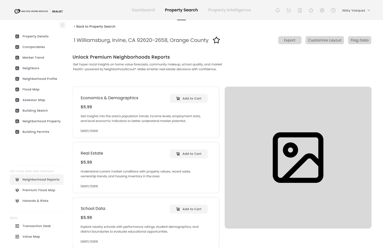
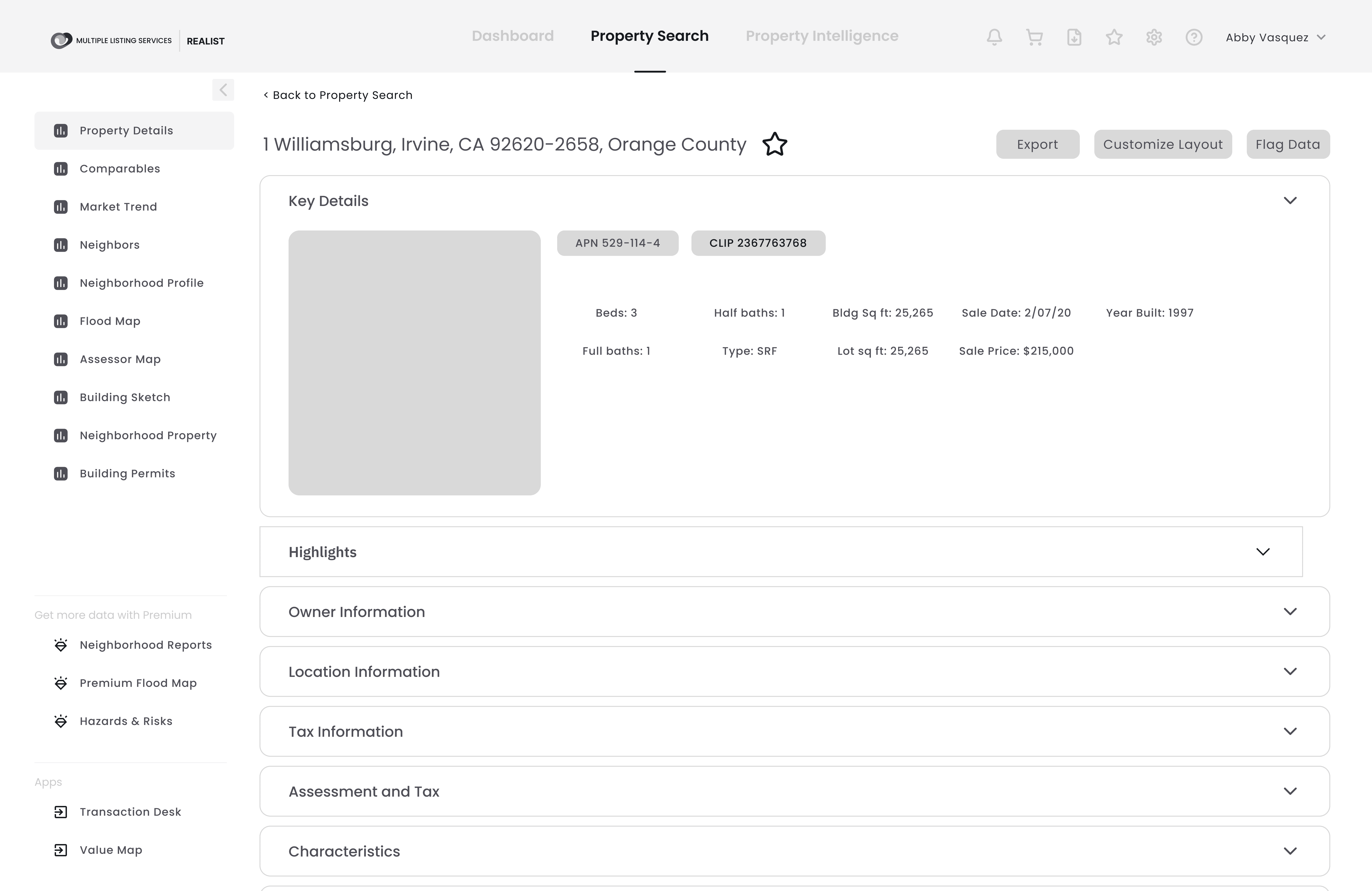
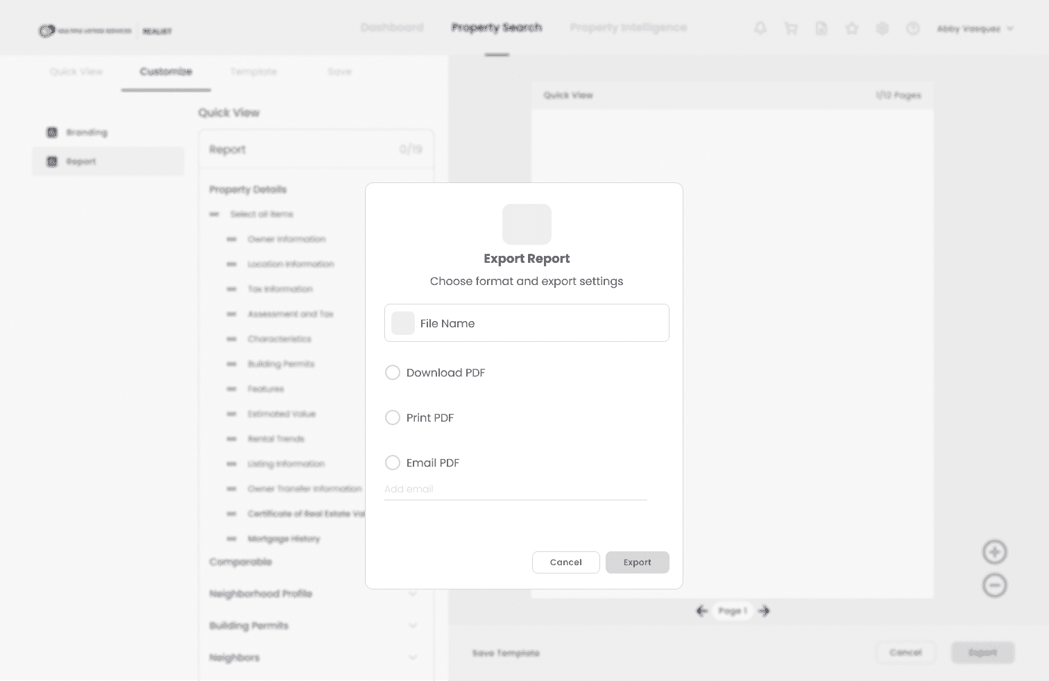
Cotality wasn't incorrect that Realist needed a UI update. However, simply making the UI more intuitive would not be enough to convince agents to buy more premium reports. I proposed a plan that would target three key areas where I could improve the overall experience while also highlighting the value of premium reports to encourage more conversions as well as provide new avenues of revenue.
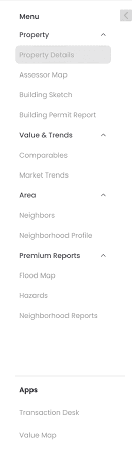
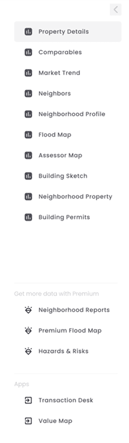
Navigation
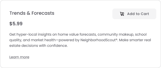
Reorganizing the menu to speed up the process for finding specific property information while also labeling premium reports
Exporting
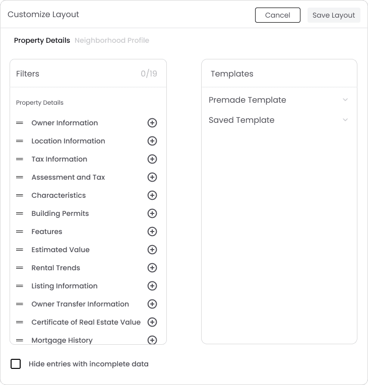
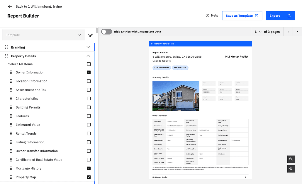
Providing a live report builder that would provide greater flexibility in adding various reports with a visual sample, including premium reports
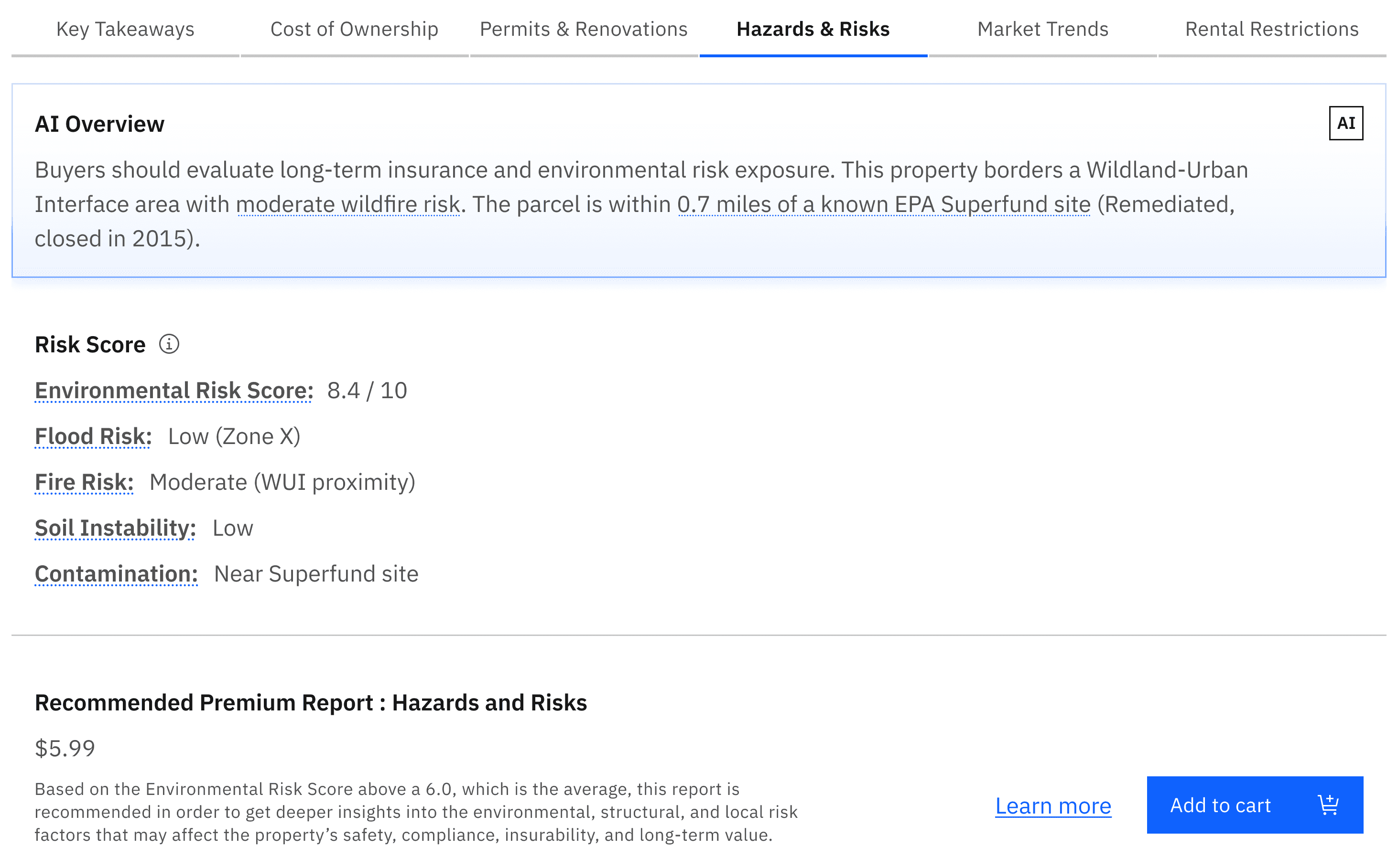
AI Highlights
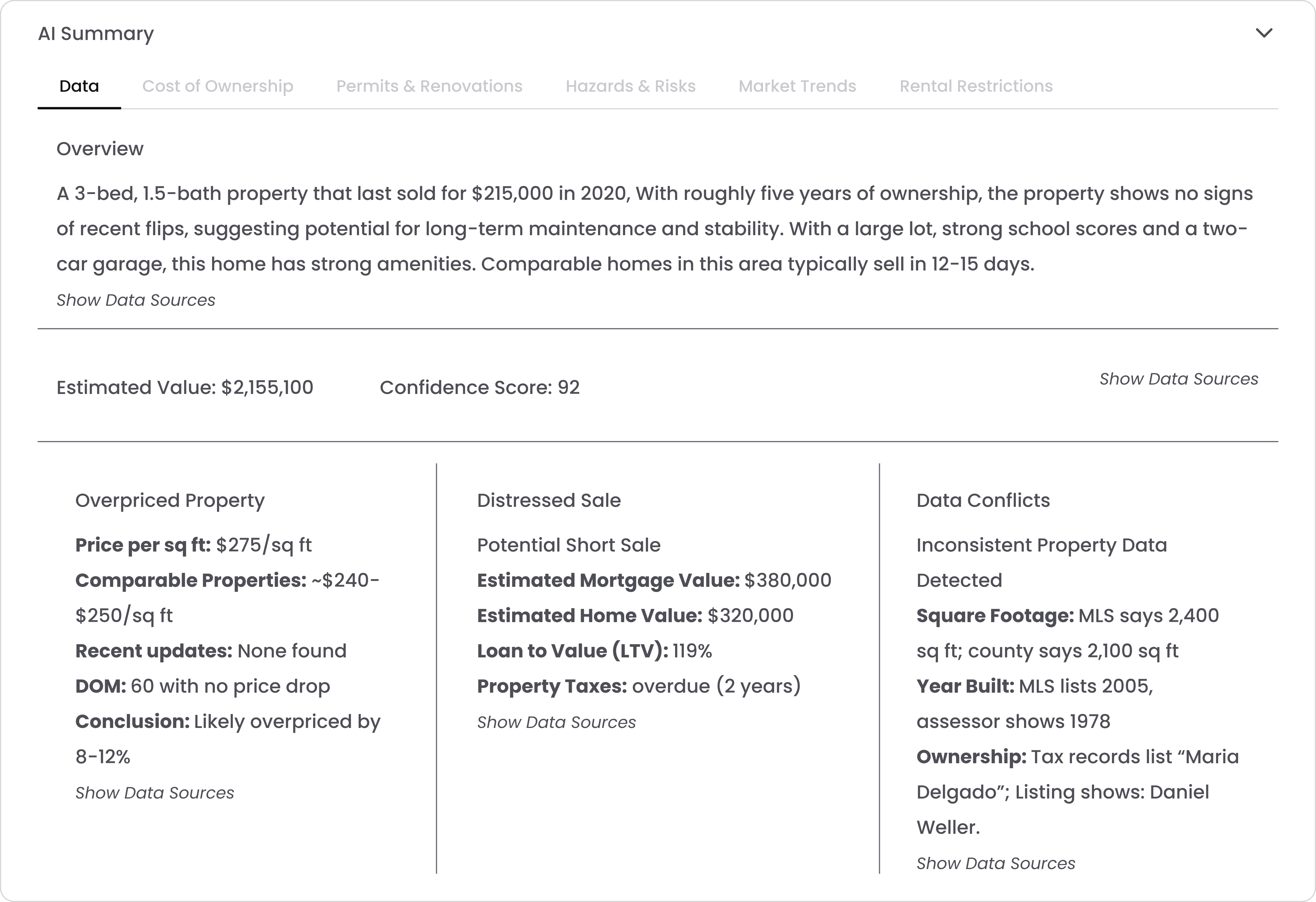
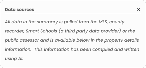
Surfacing relevant data from various reports to reduce the time needed for agents to identify any areas of concern about a property
Iterations

Proposed Solution
Navigation
Categories for scanability
Premium Report section
Minimizable menu
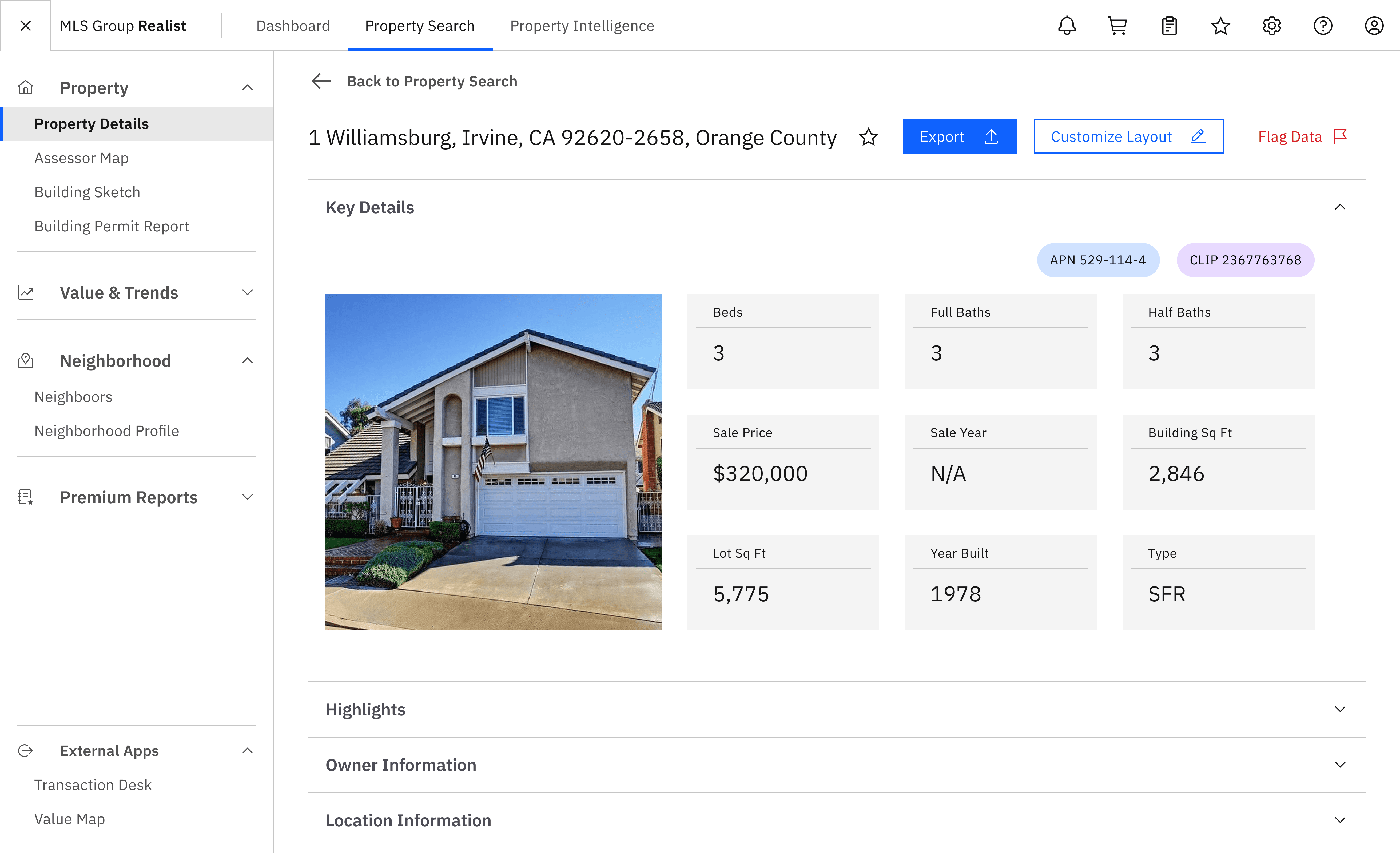
Export Builder
Visual report builder
Tailorable reports
Agent branding options
AI Highlights
Natural language summary
Curated reports
Highlighted premium data
Participant Quotes
What do agents think?
Participant 4
Navigation
I think it's very minimalistic, data-driven, and I think it works. It's very smooth... it's perfect.
Participant 2
Export Builder
I think this is the most important section... I really feel excited about the fact that I can create a listing presentation prioritizing information...
Participant 1
AI Highlights Section
I like that it has a little overview that you can read to get a good general sense, and then there's more supporting data below, and you can kind of go as deep as you want to go with it.
Outcomes
How was design translated into impact for our partners?
New feature potential
Additional revenue streams
Participant approval rate
100%
Bolstered stakeholder funding proposal for